
BEGINNER LEVEL
Support and Resistance: The Two Lines Every Trader Watches
If you show a hundred different traders the same chart with no labels and no indicators, a striking number of them will independently draw very similar lines across it. Those lines mark support and resistance, the single most widely used concept in technical analysis and very likely the first real skill you should build before touching any indicator. Everything else in this series, moving averages, RSI, chart patterns, even risk management, becomes easier to understand once you can reliably spot these levels yourself.
Throughout this series we use real, verifiable market data rather than invented examples. For this article and several others we use the Invesco QQQ Trust, the exchange-traded fund that tracks the Nasdaq 100 index, which is one of the most heavily traded instruments in the world and a far better teaching example than any single company's stock, since an index ETF reflects the combined behavior of a hundred large companies rather than the fortunes of just one. The data shown here is genuine daily price history from April to June 2026, sourced from public market records.
What support and resistance actually are
Support is a price level where, historically, buying pressure has been strong enough to repeatedly stop a decline and turn it back upward. Think of it as a floor: the price falls toward it, finds enough buyers willing to step in at that level, and bounces. Resistance is the mirror image, a price level where selling pressure has repeatedly been strong enough to stop a rally and turn it back downward, acting like a ceiling.
These levels exist because large numbers of market participants tend to make similar decisions around similar prices. Some traders set a limit order to buy if the price falls to a level they consider attractive, clustering buy orders there. Others decide in advance to take profits if the price rises to a level they view as expensive, clustering sell orders at another level. Because so many participants are watching the same obvious price points, often the prior peaks and troughs visible on a chart, those levels become self-reinforcing: traders see the level, react to it, and in doing so help create the very behavior they were anticipating.
Spotting real support and resistance: a worked example
Theory is easy. Spotting these levels on a real, messy chart is the actual skill. The chart below shows genuine QQQ daily data, and crucially, the support and resistance lines on it are not numbers chosen by eye. They are calculated directly from the chart's actual swing points: every short-term peak (a high with lower highs on both sides, marked with a red triangle) and every short-term trough (a low with higher lows on both sides, marked with a green triangle) was detected mathematically, and the lines are drawn at the price levels where those swing points cluster most tightly. This is exactly the disciplined method the rest of this article teaches, applied honestly to the data rather than guessed at.
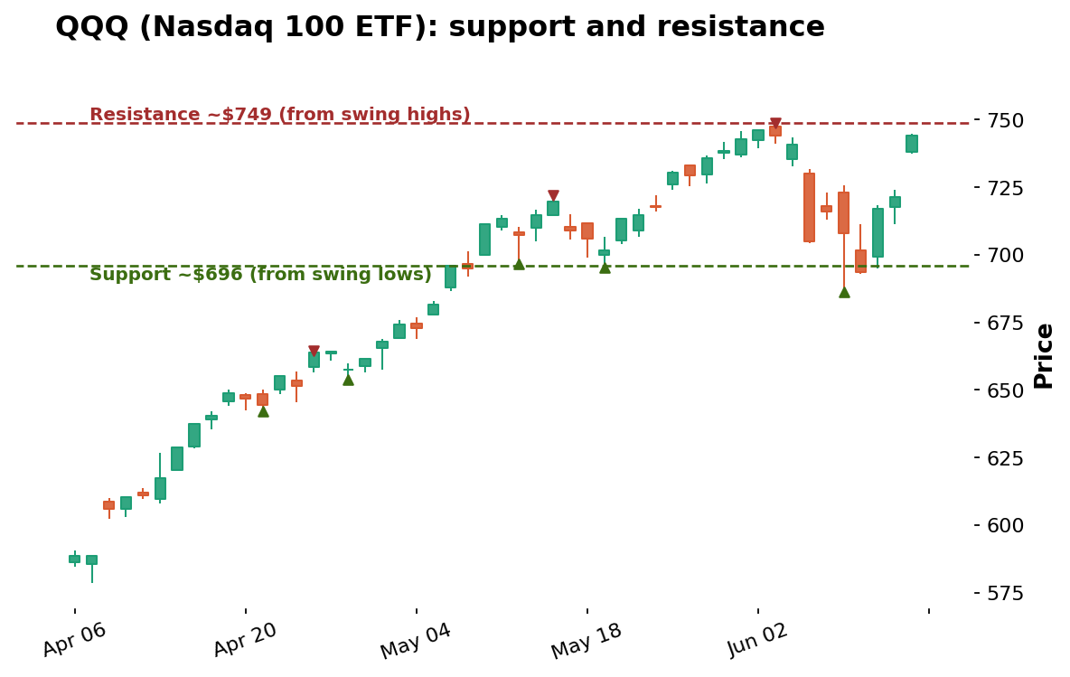
Data: stockanalysis.com (S&P Global), QQQ daily candles, Apr 6 – Jun 15, 2026. Levels derived algorithmically from detected swing highs and lows.
Two levels stand out. Resistance sits near $749, the level of the highest swing high in this window, formed on June 3 when the rally stalled and reversed. Support sits near $696, a level the price repeatedly returned to and held around in mid-to-late May, marked by the cluster of swing lows in that zone. Notice the genuine, instructive detail the real data provides: by early June the price pushed up to that $749 resistance and was rejected, then fell sharply, briefly slicing below the $696 support during the volatile June 5 to June 10 stretch before recovering back above it. Real support and resistance levels are tested, broken, and reclaimed; they are zones of pressure, not magic walls, and this real example shows that honestly rather than presenting an artificially perfect bounce.
Why the level must come from the swings, not a round number
It is tempting to glance at a chart and declare that resistance is at a clean round number like $750. Sometimes that is roughly right, but the disciplined method is to let the actual swing points define the level, because the market does not care about round numbers nearly as much as it cares about prices where real buying and selling battles have already been fought. In this QQQ example, the genuine resistance from the swing highs landed at $748.65, close to $750 but derived from where the price actually turned, not from a number that looked tidy. Building the habit of identifying levels from real turning points, rather than convenient round figures, is what separates a repeatable skill from guesswork that happens to be right occasionally.
How to actually draw these lines yourself
Start by zooming out to a timeframe that shows at least a few months of price history. Look for price levels where the chart has clearly turned more than once, the swing highs and swing lows. A level tested only once is a curiosity; a level tested two or three times, like the $696 support zone in the QQQ chart that held on multiple occasions in May, is a real support or resistance zone worth marking. Resist the temptation to draw a perfectly precise single-price line; real markets rarely respect a level down to the exact cent, so it is far more useful to think of support and resistance as zones, often a percent or two wide, rather than a single exact number.
Broken levels switch roles
The single most important practical lesson about these levels is that when a resistance level is decisively broken, it frequently flips and becomes new support on subsequent pullbacks, because the traders who regretted not buying earlier are often eager to buy a dip back toward that level afterward. The reverse is equally true; broken support often becomes new resistance. In the QQQ chart, the zone around $696 to $700 acted first as resistance in early May before the price broke above it, then served as support that the price returned to and held later in the month, a real example of a level switching roles exactly as the theory predicts.
Round numbers and psychological levels
A special case worth calling out is the psychological round number. Prices ending in a clean round figure, like $700 for QQQ, tend to attract a disproportionate number of orders simply because round numbers are easier for human beings to remember, set alerts at, and use as mental anchors when deciding where to place a limit order. This is not a mystical property of the number itself; it is a direct consequence of how people think. The real QQQ data shows price hesitating and consolidating in the high $690s to low $700s during May, exactly the kind of behavior the round-number effect predicts, layered on top of the genuine swing-based support already identified there.
This matters practically because it gives you a second, independent way to anticipate where a level might form. When a swing-based level and a round number coincide, as they roughly do near $700 here, the combined level tends to carry more weight than either reason alone, a theme this series returns to once moving averages are introduced as yet another independent source of support and resistance.
How this concept shows up across markets
Although support and resistance is genuinely universal, the texture of how it appears shifts somewhat between asset classes, a theme dedicated market-specific articles cover later. In forex, round numbers appear at clean exchange-rate levels like 1.1000 on EUR/USD, often coinciding with large standing institutional orders. In gold, round numbers like $2,000 or $2,500 per ounce act as significant magnets, debated extensively in financial media precisely because so many participants watch the same level. In cryptocurrency, round numbers like $50,000 or $100,000 for bitcoin function almost identically, frequently becoming the subject of widespread public attention that itself reinforces the level. The index ETF used here, QQQ, sits at the calmer, more liquid end of this spectrum, which is part of why its levels tend to be relatively clean and orderly compared with a thinly traded individual asset.
False breakouts and how to filter them
Not every push through a level is genuine, and false breakouts, sometimes called fakeouts, are one of the most common ways this concept costs beginners money. A false breakout occurs when price pokes briefly past a level, triggering breakout traders into new positions, only to reverse back inside the prior range shortly afterward. A widely used filter is waiting for a candle to close beyond the level, rather than reacting to any intraday touch, since a close represents where buyers and sellers actually settled for that period rather than a fleeting excursion. The June dip in the QQQ chart, where price briefly broke below the $696 support intraday before closing back above it within a few sessions, is a real illustration of why reacting to a single intraday poke through a level, rather than waiting for sustained closes beyond it, so often leads to being caught on the wrong side.
A simple practice routine
Like any chart-reading skill, recognizing genuine support and resistance reliably takes repetition. A useful exercise is to pull up twenty or thirty historical charts across different assets, cover the right-hand portion of each chart so you cannot see what happened next, mark where you believe the next reaction is likely based only on the visible swing points, then reveal the rest of the chart to check your work. Doing this consistently, even for fifteen minutes a day over a few weeks, builds an intuitive feel for these levels far faster than reading definitions alone, and it directly mirrors the disciplined, swing-based method used to identify the $696 and $749 levels on the QQQ chart in this article.
It is also worth noting that support and resistance levels carry more weight when multiple, independent forms of evidence point to the same price. A level that coincides with a prior swing high, a round number, and a moving average all at once is generally more significant than a level identified from price history alone, a theme this series revisits once moving averages are introduced.
Why these levels matter for speculation
Support and resistance give a speculator three immediately practical things, which is why this skill is worth building before any indicator. First, they suggest entry zones: buying near support in an uptrend, or selling near resistance if betting on a reversal, generally offers a better risk-to-reward setup than buying in the middle of nowhere on the chart. Second, they suggest logical places for a stop-loss, since a clean break through a level is meaningful evidence your original thesis was wrong, far more useful than picking an arbitrary stop price. Third, they suggest profit targets, since the next level above an entry is a natural place to expect selling pressure to reappear. On the QQQ chart, a trader who bought near the $696 support zone in May would have had both a logical entry and, in the $749 resistance above, a sensible first target, with the level itself defining where to admit the idea had failed if price broke down through it instead. We will use this exact logic when we reach risk management later in this series.
Key takeaways
Support is a price floor where buying pressure has repeatedly stopped declines; resistance is a price ceiling where selling pressure has repeatedly stopped rallies.
The levels on the chart in this article were derived algorithmically from real detected swing highs and lows in QQQ data, not chosen by eye, which is exactly the disciplined method the article teaches.
On the real QQQ data from Apr to Jun 2026, resistance formed near $749 (the highest swing high) and support near $696 (a repeatedly tested swing-low zone), with the June pullback briefly breaking support before reclaiming it.
Define levels from genuine swing points rather than convenient round numbers, treat them as zones a percent or two wide, and require at least two real tests before trusting a level.
A decisively broken resistance level often becomes new support, and broken support often becomes new resistance, as the $696 to $700 zone in the QQQ chart demonstrates.
Disclaimer
This article is for educational purposes only and does not constitute financial or investment advice. Support and resistance levels are based on historical price behavior and are not guaranteed to hold in the future. The QQQ example used here is real historical data shown for illustration and is not a recommendation to buy or sell any security. Always do your own research and consider consulting a licensed financial advisor before trading or investing.