
EXPERT LEVEL
Sector Rotation and Relative Strength
The beginner article in this stocks track made the point that no stock trades in isolation: every individual stock is influenced by the broader market and by its sector. This expert article develops that idea into two of the most powerful concepts available to a stock trader: relative strength, the measurement of how a stock is performing compared to the market or its peers, and sector rotation, the tendency for leadership to shift between different parts of the market over time. Together, these concepts move a trader beyond analyzing a single chart in isolation toward understanding where the strength in the market actually is, which is often the difference between a good trade and a merely acceptable one. The examples use real, verifiable NVIDIA (NVDA) and SPDR S&P 500 ETF (SPY) data from April to June 2026.
What relative strength actually measures
Relative strength, in this context, is not the same as the Relative Strength Index (RSI) from the Foundation series, which is a momentum oscillator calculated from a single asset's own price. Relative strength here means comparing one asset's performance directly against another, almost always a stock against a broad market benchmark like the S&P 500. The core idea is simple but powerful: a stock that is rising faster than the market in an uptrend, or falling less than the market in a downtrend, is showing relative strength, which indicates that buyers favor it specifically, beyond whatever is lifting the whole market. A stock that lags the market is showing relative weakness. Professional traders place enormous weight on this, because the stocks showing the greatest relative strength during a market advance are frequently the ones that lead the next leg higher, while relative weakness often warns of trouble even before it shows up clearly in the stock's own chart.
Measuring relative strength on real data
The cleanest way to see relative strength is to index two assets to the same starting value and watch them diverge, then plot the ratio between them directly.
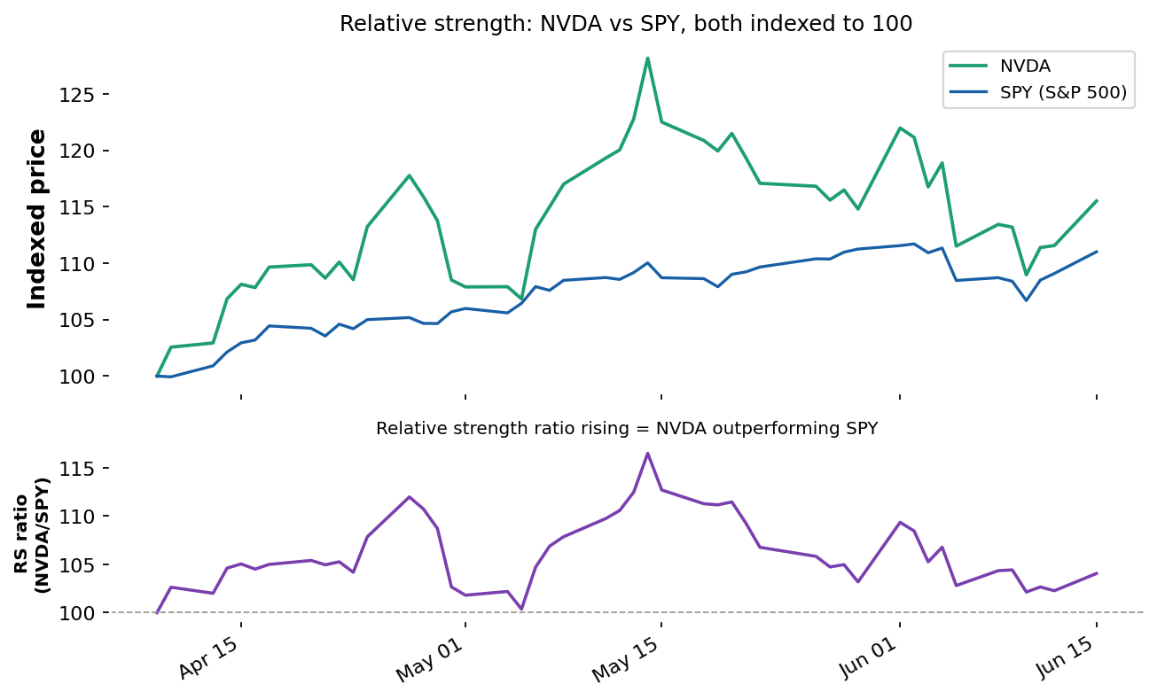
Data: stockanalysis.com (S&P Global / Tiingo), NVDA and SPY daily closes, Apr 9 – Jun 15, 2026. Both indexed to 100 at the start; lower panel shows the NVDA/SPY ratio.
In the upper panel, both NVDA and SPY begin at 100, and you can see NVDA pulling decisively ahead during the April and early-May rally, reaching well above the broad market before both gave back ground later. The lower panel plots the relative strength ratio, NVDA's price divided by SPY's, indexed to 100. When this ratio rises, NVDA is outperforming the S&P 500; when it falls, NVDA is lagging. The ratio's peak coincides with NVDA's mid-May record high, the point of maximum outperformance, after which it declined as NVDA fell faster than the broad market into June. This is the practical value of a relative strength ratio: it isolates the stock's performance against the market, stripping out the general market move so you can see whether the stock itself is genuinely leading or merely being carried along. A rising ratio during a market advance is a hallmark of genuine leadership; a falling ratio, even while the stock's own price rises, warns that the stock is lagging its peers and may be a weaker choice than its standalone chart suggests.
Why relative strength leads price
The reason relative strength is so valued is that it often shifts before a stock's absolute price does. Large institutional investors, who move enormous amounts of capital, cannot buy or sell their full positions instantly without moving the price against themselves, so they accumulate or distribute over days and weeks. This sustained institutional buying frequently shows up first as relative strength, the stock quietly outperforming the market, before it culminates in a clear breakout on the stock's own chart. By watching relative strength, a trader can sometimes identify where institutional money is flowing before that flow becomes obvious in the price alone, the same logic of looking beneath the surface that motivated on-chain analysis in the crypto track, applied here through the lens of cross-market comparison.
Sector rotation: leadership moves over the cycle
Individual stocks belong to sectors, technology, energy, financials, healthcare, consumer staples, and others, and these sectors do not all perform well at the same time. Sector rotation describes the well-documented tendency for market leadership to shift between sectors as the economic cycle and investor sentiment evolve.
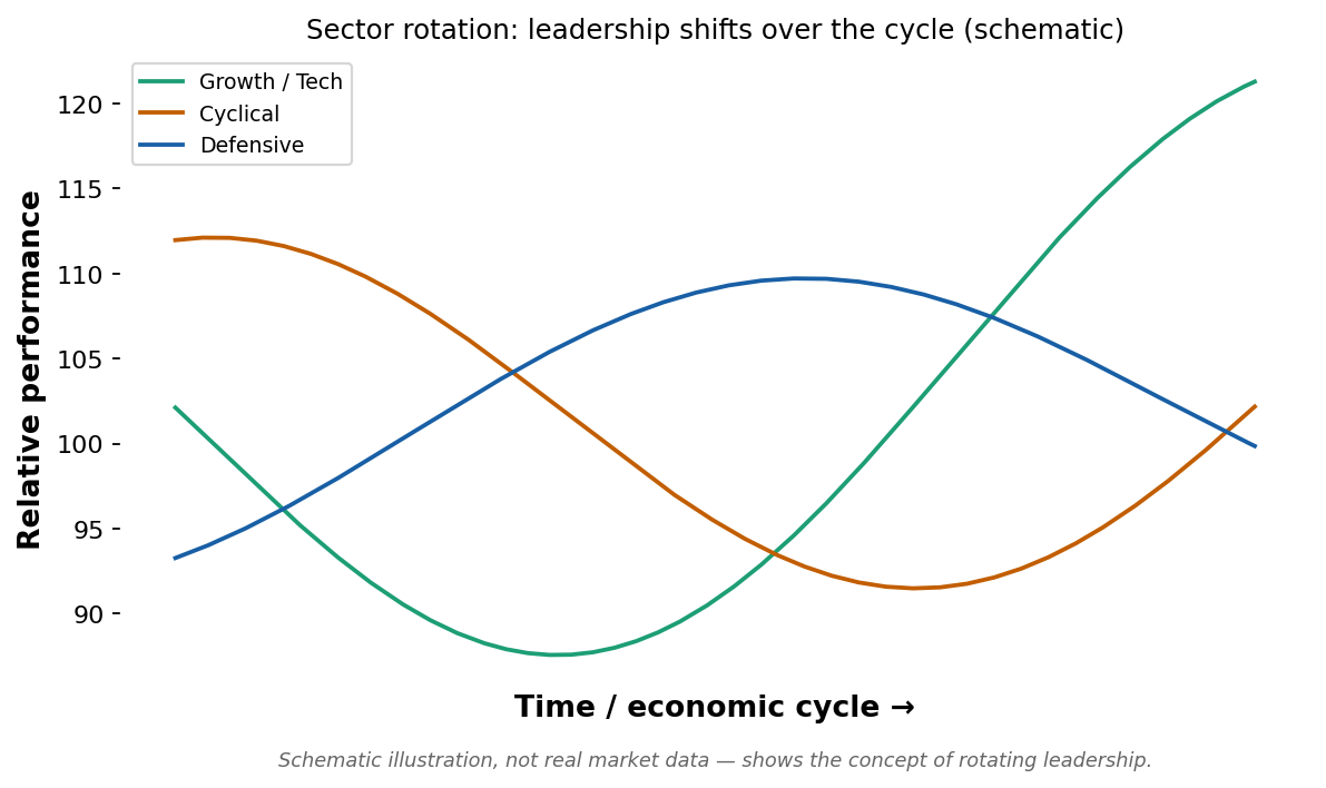
Schematic illustration, not real market data, showing the concept of leadership rotating between sectors over the economic cycle.
The schematic above illustrates the general idea: at different points in the economic cycle, different categories of stocks tend to lead. Broadly, and with many exceptions, growth and technology stocks often lead during periods of optimism and easy financial conditions; cyclical sectors tied to economic activity tend to perform well as the economy expands; and defensive sectors, such as utilities and consumer staples, often hold up better when investors turn cautious or the economy weakens. The practical lesson for a technical trader is not to memorize a rigid cycle, since the real world is far messier than any textbook diagram, but to be aware that the sector a stock belongs to is itself a powerful force on its performance. A technically strong stock in a sector that is rotating out of favor faces a headwind, while even a moderately strong stock in a sector rotating into favor enjoys a tailwind.
Using ETFs to read sector strength directly
A practical tool that makes sector analysis far easier is the sector ETF. Just as SPY tracks the broad S&P 500, there are exchange-traded funds that track each major sector, technology, energy, financials, healthcare, utilities, and the rest, allowing a trader to read the relative strength of an entire sector with a single chart rather than averaging many individual stocks by hand. The same relative strength technique applies: index a sector ETF and the broad market to the same starting value, plot the ratio, and a rising ratio shows the sector is leading while a falling ratio shows it lagging. This turns the abstract idea of sector rotation into something directly observable on a chart. A disciplined top-down trader can scan a handful of sector ETF ratios against the broad market in minutes to see where leadership currently sits, then drill into the leading sectors to find individual stocks, exactly the sequence described above, made practical by the existence of these sector vehicles. The same approach extends to comparing sectors against one another, not just against the market, to see which areas are gaining strength at the expense of others, the very essence of rotation.
Breadth: confirming a move with participation
A concept closely related to relative strength and sector rotation is market breadth, which measures how many stocks are participating in a market move rather than just where the headline index is trading. A market index can rise while breadth is narrow, meaning only a handful of large stocks are driving the gain while the majority of stocks are flat or falling, a condition many analysts regard as a warning sign that a rally rests on a fragile, narrow foundation. Conversely, a rally with broad participation, where the large majority of stocks and sectors are rising together, is generally considered healthier and more durable. Breadth is measured with indicators such as the number of stocks advancing versus declining, or the percentage of stocks trading above a key moving average. For an expert stock trader, breadth adds yet another independent lens, since a strong individual setup carries more weight when broad market breadth confirms that participation is widespread, and deserves more caution when the broader market's strength is concentrated in just a few names. As with every tool in this series, breadth is a confirming input that adjusts conviction rather than a standalone trade trigger.
Combining relative strength and sector rotation in practice
The most powerful application combines the two concepts in a top-down way, the same top-down discipline introduced in the multi-timeframe article. A trader first identifies which sectors are showing relative strength against the broad market, concluding that this is where leadership and institutional money currently sit. Then, within those leading sectors, the trader looks for the individual stocks showing the greatest relative strength against both the market and their sector peers. Finally, the trader applies ordinary technical analysis, support, resistance, trend, and risk management, to find a precise, well-defined entry on those specific leaders. This sequence concentrates attention on the stocks most likely to outperform: strong stocks, in strong sectors, in a market that supports them, entered at technically favorable points. It is a more demanding process than analyzing a single chart in isolation, which is precisely why it sits at the expert level, and why it tends to produce higher-quality opportunities than picking stocks one chart at a time without regard to the larger landscape.
It is worth emphasizing how naturally these tools build on the rest of the series rather than replacing anything. Relative strength is simply a comparison applied to the price data you already know how to read; sector rotation is the same trend analysis applied to groups of stocks rather than one; and breadth is participation measured across many charts at once. None of them requires abandoning support, resistance, trends, or risk management. They widen the lens, helping you choose which stock to apply your existing skills to, which is frequently a more valuable decision than any single entry or exit on a chart you have already chosen.
The limits and cautions of these tools
Relative strength and sector rotation are powerful but not infallible. Relative strength can reverse, sometimes sharply, and a stock that has led for months can become a laggard quickly, as the real NVDA example showed when its relative strength peaked and then declined. Sector rotation is a broad tendency, not a precise schedule, and attempts to predict it too rigidly frequently fail because real economic cycles do not follow textbook diagrams. Both tools are best used as additional, confirming inputs that improve the odds and focus attention, layered on top of the price-based technical analysis and risk management that remain the foundation, rather than as standalone predictive systems. As always in this series, no single tool replaces the discipline of defining an entry, a stop, and a position size before committing capital.
Practical guidelines
Measure relative strength by comparing a stock directly against a market benchmark, indexing both to the same start and watching the ratio; a rising ratio signals genuine leadership.
Favor stocks showing relative strength during a market advance, since they are often the leaders of the next leg higher, and be cautious of relative weakness even when a stock's own price is rising.
Be aware of which sector a stock belongs to and whether that sector is rotating into or out of favor, since the sector trend is a powerful tailwind or headwind on the individual stock.
Use a top-down process: find strong sectors, then strong stocks within them, then precise technical entries, concentrating on strong stocks in strong sectors in a supportive market.
Treat relative strength and sector rotation as confirming inputs that improve odds and focus attention, not as standalone predictive systems that replace price analysis and risk management.
This completes the stocks track. Taken together, the three articles show that trading individual stocks rewards the same disciplined technical analysis built throughout this series, applied with awareness of the features unique to stocks, company-specific risk, earnings gaps, the central role of volume, and the powerful influence of relative strength and sector rotation that connect each stock to the larger market around it.
Key takeaways
Relative strength here means comparing a stock's performance directly against a market benchmark, distinct from the single-asset RSI indicator from the Foundation series.
On the real NVDA versus SPY data, NVDA's relative strength ratio peaked at its mid-May record high, then declined as it fell faster than the market into June, isolating the stock's leadership from the general market move.
Relative strength often shifts before absolute price, because large institutions accumulate over time, making it a way to spot where money is flowing early.
Sector rotation is the tendency for leadership to shift between sectors over the economic cycle; a stock's sector is a powerful tailwind or headwind on its performance.
The most powerful application is top-down: strong stocks, in strong sectors, in a supportive market, entered at technically favorable points, treating these tools as confirming inputs rather than standalone systems.
Disclaimer
This article is for educational purposes only and does not constitute financial or investment advice. The NVDA and SPY examples used here are real historical data shown for illustration and are not a recommendation to buy or sell any security. The sector rotation diagram is a schematic illustration. Always do your own research and consider consulting a licensed financial advisor before trading or investing.