
EXPERT LEVEL
Multi-Timeframe Analysis: Aligning Signals Across Charts
A trader who only ever looks at one timeframe is making a decision, often without realizing it, that the time horizon they happened to load when they opened their charting platform is the correct one for every decision. Multi-timeframe analysis is the practice of deliberately examining the same asset across more than one timeframe, typically a longer one to establish context and a shorter one to time entries, and reconciling what each one is telling you before acting. It is generally considered an intermediate-to-advanced skill because it requires holding two potentially different pictures of the same market in your head simultaneously without getting confused about which one should drive the actual decision.
Why the same asset can look different on different timeframes
A weekly chart and a daily chart of the same asset are not contradictory; they answer different questions. A weekly chart compresses five days of trading into a single candle, which smooths out a tremendous amount of short-term noise and reveals the larger structural trend far more clearly than a zoomed-in daily view can. A daily chart, in turn, compresses single sessions into individual candles and shows tactical detail, like the exact shape of a pullback or a short-term support level, that simply disappears when five days get averaged into one weekly candle. Neither view is more correct; they describe the same underlying price history at different levels of resolution.
The same real data, two resolutions
Here is the real QQQ daily data used throughout this series, aggregated into genuine weekly candles on the left, alongside a zoomed-in daily view of the final few weeks of the period on the right. The weekly candles are not invented or estimated; each one is calculated directly from the real daily opens, highs, lows, and closes for that calendar week, using the actual first open, highest high, lowest low, and final close of each five-day window.
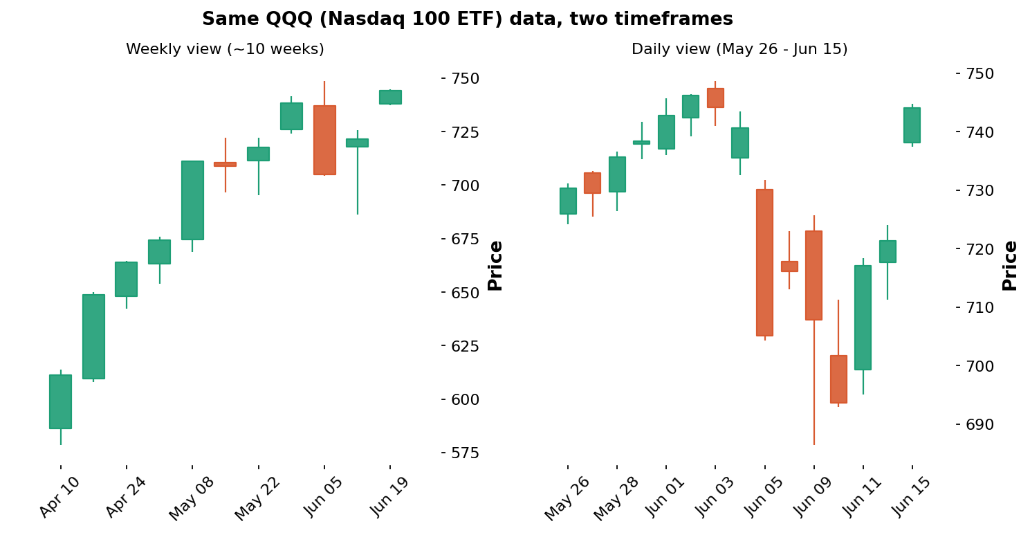
Data: stockanalysis.com (S&P Global), QQQ, Apr 6 – Jun 15, 2026. Weekly candles aggregated from real daily data; daily panel shows May 26 – Jun 15, 2026.
The weekly view on the left makes the larger structure almost embarrassingly obvious: a steady, persistent climb across nearly every week of the period, with only the final couple of weeks showing genuine two-sided volatility, a clean, readable uptrend once the daily noise is compressed away. The daily view on the right, covering only the final few weeks, shows considerably more texture: the tight consolidation near the highs in late May and early June, then the sharp June 5 plunge, the further turbulence into June 10, and the recovery toward the highs by June 15. A trader looking only at the daily chart during that early-June plunge might have felt real uncertainty about whether the broader uptrend was ending; the weekly chart, showing those same sessions as a single volatile candle within a much larger and still clearly intact uptrend, would have offered considerably more confidence to hold or even buy that dip.
A practical three-timeframe framework
Many experienced traders use a simple structure: one timeframe for context, one for setup, and one for precise timing, with each timeframe roughly four to six times longer than the one below it. A common combination for a swing trader holding positions for days to weeks might be the weekly chart for overall trend context, the daily chart for identifying specific setups like the patterns covered earlier in this series, and a 4-hour chart for fine-tuning the exact entry once the daily setup has triggered. A day trader operating within a single session might instead use the daily chart for context, an hourly chart for setup, and a 5-minute chart for entry timing. The specific timeframes matter less than the discipline of always checking a longer view before committing to a decision based on a shorter one.
Top-down versus bottom-up workflow
There are two broad ways to organize a multi-timeframe review, and most experienced traders settle firmly on the first. A top-down workflow starts with the longest relevant timeframe, establishes the overall trend and major levels there, and only then moves to progressively shorter timeframes to refine entry timing within that established context. A bottom-up workflow does the reverse, starting with a short-term signal and only checking the longer-term picture afterward. The risk with bottom-up is subtle but real: having already become emotionally invested in a short-term idea before checking the broader context makes it considerably easier to rationalize a longer-term picture that does not actually support the trade, a form of confirmation bias covered in the trading psychology article. Establishing the broader context first, before a specific short-term idea has created that bias, is the core reason top-down is the standard, recommended sequence.
Matching your three timeframes to your actual holding period
The specific timeframes that make sense depend heavily on how long you actually intend to hold, and mismatching them is a common, avoidable error. A position trader holding for weeks to months might use the monthly chart for context, the weekly for setup, and the daily for entry timing, a full step slower than the swing example above. A very short-term intraday trader might use the daily only as a rough backdrop, an hourly chart for setup, and a 1-minute or 5-minute chart purely for execution. A frequent beginner error is borrowing a framework designed for one holding period, for example a day-trading framework built around hourly and 5-minute charts, while actually intending to hold for several weeks, which results in far too much short-term noise driving decisions that should be anchored to a much longer context.
What to do when timeframes disagree
The genuinely difficult case, and the reason this skill sits at the expert level, is what to do when the longer and shorter timeframes conflict, for example a weekly chart in a clear uptrend while the daily chart has just broken its own shorter-term rising trendline, exactly the situation the early-June QQQ plunge created. There is no single universally correct answer, but the standard practice among experienced traders is to give the longer timeframe more weight for the overall directional bias, while using the shorter timeframe's signal as a reason for caution, a smaller position size, or a wait for further confirmation, rather than as a reason to take a full-sized position directly against the longer-term trend. A short-term break against a much larger uptrend is, more often than not, exactly the kind of pullback the weekly view would have helped a trader sit through calmly rather than react to in isolation, as the QQQ recovery into mid-June illustrates.
Multi-timeframe analysis across asset classes
This framework applies just as directly to forex, crypto, and gold as it does to the QQQ index example used here, though the specific timeframes traders favor shift somewhat by market. Because crypto markets trade continuously, twenty-four hours a day, with no overnight gaps to reset the picture, shorter-term crypto traders often place even more emphasis on a clean weekly or daily context chart specifically because the absence of a natural session break makes short-term noise harder to distinguish from genuine shifts in direction. Forex traders frequently anchor their context to the daily or weekly chart but pay close attention to specific recurring time windows within the day, such as the overlap between the London and New York sessions, when liquidity and volatility both increase sharply, adding a time-of-day dimension that has no direct equivalent in an index ETF trading during a single exchange's regular hours.
A worked walk-through using the real QQQ example
Putting the full top-down sequence together on the real data: starting with the weekly chart, the picture is unambiguous, a steady climb across nearly every week with only the final stretch turning volatile, giving a clear bullish bias to work with. Moving to the daily chart for setup, the early-June plunge stands out as a sharp pullback within that established weekly uptrend, the kind of dip toward prior support that a top-down trader would treat as a potential opportunity rather than an automatic exit. A trader could then drop to a shorter intraday timeframe purely to fine-tune an entry near that support once the selling showed signs of stabilizing, rather than guessing at a price in advance or panic-selling into the decline. This is the entire multi-timeframe framework in miniature, applied to one real, verifiable stretch of price history rather than left as an abstract description.
Why alignment across timeframes raises the odds
The deeper reason multi-timeframe analysis improves results is that it stacks independent confirmations on top of one another, and a setup confirmed by several timeframes at once is statistically more reliable than one supported by a single chart. When the weekly chart shows a clear uptrend, the daily chart shows a clean pullback to support within that uptrend, and a shorter intraday chart shows the selling beginning to stabilize at that support, three separate lenses are all pointing the same direction, which is a meaningfully stronger basis for a trade than any one of them alone. Conversely, when the timeframes disagree, that disagreement is itself valuable information, a signal to reduce size, wait, or stand aside rather than force a trade through conflicting evidence. This is the same principle of confluence that runs throughout this series, the idea that the highest-probability opportunities are the ones where multiple independent factors agree, applied specifically to the dimension of time. A trader who internalizes this stops thinking of the daily chart as the chart and starts thinking of every timeframe as one witness among several, none of them authoritative alone, but powerful when they corroborate one another.
Common mistakes with multiple timeframes
Checking a longer timeframe only when a trade is already losing, looking for reassurance, rather than consistently before every decision regardless of how a trade is currently performing.
Using too many timeframes at once, which tends to produce decision paralysis rather than clarity; three well-chosen timeframes are almost always more useful than six.
Giving the shortest timeframe equal weight to the longest, when the standard, more reliable practice is to let the longer timeframe set the directional bias and use the shorter mainly for timing.
Forgetting that an aggregated longer-timeframe candle, like the weekly candles shown here, is still built entirely from the same real underlying daily data; it is a different lens on the same reality, not separate or more authoritative information.
Switching the long-term timeframe itself frequently depending on which one happens to currently agree with a trade idea already in mind; the context timeframe should be chosen in advance and used consistently.
As with every skill in this series, the goal is not to mechanically check three charts before every trade out of habit, but to internalize the underlying question, does this decision make sense in the context of the bigger picture, until it becomes a natural part of how you read any chart at all, on any timeframe, by default.
Key takeaways
Multi-timeframe analysis means deliberately checking more than one chart resolution for the same asset, typically a longer one for context and a shorter one for timing.
A weekly candle is calculated directly from five real daily candles using the actual first open, highest high, lowest low, and final close; it is the same real data at a different resolution, not a separate dataset.
On the real QQQ data, the weekly chart shows a clean, almost ambiguity-free uptrend, while the daily chart for the same period reveals the early-June plunge that looked far more alarming in isolation than in weekly context.
A practical framework uses three timeframes, each several times longer than the next, for context, setup, and precise entry timing, organized top-down rather than bottom-up.
When timeframes disagree, standard practice gives the longer timeframe more weight for overall direction and treats the shorter timeframe's conflicting signal as a reason for caution or reduced size, not an automatic reversal of bias.
Disclaimer
This article is for educational purposes only and does not constitute financial or investment advice. The weekly chart shown here is built by aggregating real historical QQQ daily data and is not a recommendation to buy or sell any security. Always do your own research and consider consulting a licensed financial advisor before trading or investing.