
BEGINNER LEVEL
How to Read a Stock Chart: A Practical Beginner's Guide
If you have worked through the Foundation articles in this series, you already know how to read price structure: trends, support and resistance, moving averages, and the rest. This article narrows that general skill specifically to individual stocks, which have a few characteristics that index ETFs do not. Stocks are where most people first encounter technical analysis, and they come with their own quirks: scheduled earnings reports, company-specific news, gaps, and a direct relationship to the broader market and their own sector. Understanding these features turns the general chart-reading skill from the Foundation series into a practical tool for trading individual companies.
Throughout this article we use real, verifiable daily data for NVIDIA Corporation, ticker NVDA, one of the most heavily traded stocks in the world, covering April to June 2026 and sourced from public market records. NVDA is a useful example precisely because it is volatile and news-sensitive enough to display, in a single short window, nearly every feature that makes individual stocks different from a broad index.
The candlestick, revisited for stocks
Every stock chart you will use is built from candlesticks, and since they are the fundamental unit of everything that follows, it is worth being completely precise about what each one shows.
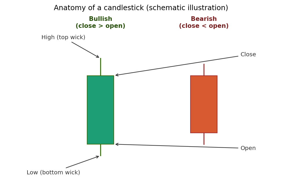
Schematic illustration of a single candlestick's components.
Each candlestick summarizes one period of trading, usually one day on a daily chart. The thick part, called the body, spans the distance between the opening price and the closing price. When the close is higher than the open, the candle is typically colored green (or white) and is called bullish, meaning buyers won that period. When the close is lower than the open, the candle is typically colored red (or black) and is called bearish, meaning sellers won. The thin lines extending above and below the body, called wicks or shadows, mark the highest and lowest prices reached during the period. A long upper wick means the price pushed up during the day but was driven back down by the close; a long lower wick means the opposite. Learning to read the message in a candle's shape, a small body with long wicks signals indecision, a large body with short wicks signals conviction, is the foundation of all candlestick analysis.
Reading a real stock chart
Here is a real NVDA chart, with the volume bars shown beneath the price, which is how a stock chart is most usefully displayed.
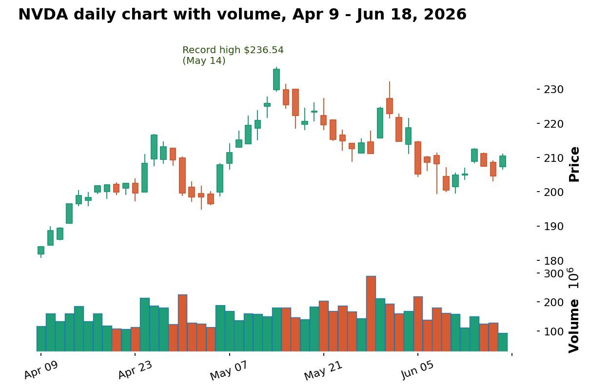
Data: stockanalysis.com (S&P Global), NVIDIA Corporation (NVDA), daily candles with volume, Apr 9 – Jun 18, 2026.
Walk through what this real chart shows. From early April, NVDA climbs steadily from around $184 to a record high of $236.54 on May 14, a strong uptrend of exactly the kind covered in the Foundation series, with each pullback finding a higher floor. After the May 14 peak, the character changes: the stock rolls over into a decline through late May, finds some footing in early June, then experiences another sharp drop before stabilizing in the low $200s by mid-June. The volume bars beneath tell their own story, with the heaviest trading clustering around the biggest price moves, a relationship we will return to shortly because it is one of the most important things volume reveals.
Why volume matters so much for stocks
Volume, the number of shares traded in a period, is shown for stocks far more prominently than for many other assets, and for good reason: it measures the conviction behind a price move. A price rise on heavy volume reflects broad, committed buying and is generally considered more trustworthy than a rise on light volume, which may reflect only a few participants and is more prone to reversing. The single most useful principle is that volume ideally confirms the trend: in a healthy uptrend, advancing days tend to show higher volume than declining days, and the reverse in a downtrend. When a price makes a new high but volume is shrinking, it is a subtle warning that conviction is fading even as price extends, the same divergence concept introduced with RSI in the Foundation series, applied here to volume. On the real NVDA chart, the biggest single-day moves consistently coincide with the tallest volume bars, which is exactly what you would expect, since large moves are precisely the moments when the most participants are trading.
What makes individual stocks different from an index
An index ETF averages together many companies, which smooths out events specific to any one of them. An individual stock has no such smoothing, and this is the single most important practical difference. A single company can move violently on news that affects only it, an earnings report, a product announcement, an analyst upgrade or downgrade, a regulatory ruling, a change in leadership. None of these would noticeably move a broad index, but any of them can move an individual stock by 5, 10, or even 20 percent in a single session. This means that when you trade an individual stock, you are exposed to company-specific risk that no amount of chart reading can anticipate, which is precisely why the risk management discipline from the Foundation series, predetermined stops and careful position sizing, matters even more for individual stocks than for an index.
The earnings calendar: a scheduled volatility event
One feature unique to individual stocks is the earnings report, a scheduled event, typically once per quarter, when a company reveals its financial results. Earnings reports are among the most significant predictable volatility events in all of stock trading, because the actual numbers, and the company's guidance about the future, frequently differ from what the market expected, causing sharp, immediate repricing. A stock can gap up or down dramatically the moment earnings are released, often outside of regular trading hours. For a technical trader, the key practical point is that earnings dates are known in advance, which means you can choose deliberately whether to hold a position through an earnings report, accepting the binary, hard-to-predict risk, or to step aside beforehand. Many disciplined speculators avoid holding positions through earnings precisely because the outcome is so difficult to anticipate from a chart and the resulting move can blow straight through a normal stop-loss. We examine these gap moves in detail in the next, intermediate article of this stocks track.
Connecting a stock to its market and sector
A final feature distinguishing individual stocks is that no stock trades in isolation; each one is influenced by the direction of the broader market and of its specific sector. When the overall market falls sharply, the great majority of individual stocks fall with it regardless of their own merits, and when a sector falls out of favor, even strong companies within it tend to struggle. This means a complete analysis of an individual stock should always include a glance at the broader market index and the stock's sector, since a beautiful bullish setup on a single stock is far less appealing if the entire market is breaking down around it. The expert article in this stocks track explores this relationship in depth through the concepts of relative strength and sector rotation.
Choosing a timeframe for stock charts
A practical question every stock trader faces is which timeframe to read, and the answer depends entirely on how long you intend to hold a position. A long-term investor checking a stock occasionally might look only at the weekly chart, where each candle represents a full week and the broad trend is clearest. A swing trader holding for days to weeks, the most common style for applying the techniques in this series, typically anchors to the daily chart, like the NVDA chart used throughout this article, while glancing at the weekly for context. A day trader operating within a single session works on much shorter intraday charts, where each candle might represent five minutes or even one minute. The same stock can look quite different across these timeframes, and as the multi-timeframe article in the Foundation series explained, the disciplined approach is to use a longer timeframe to establish the overall trend and direction before zooming in to a shorter one to time a precise entry. Loading a one-minute chart and trading off it without ever checking the daily trend is one of the most common beginner mistakes, since it amounts to making decisions with no awareness of the larger structure surrounding them.
Pre-market, regular hours, and after-hours trading
Unlike a continuously traded asset, a stock has a defined regular trading session, in the United States from 9:30 a.m. to 4:00 p.m. Eastern time, but trading also occurs in thinner pre-market and after-hours sessions around it. This matters for two practical reasons. First, the most significant company news, including earnings reports, is frequently released outside regular hours precisely to give the market time to absorb it, which is why a stock can open the next morning at a dramatically different price, the gap phenomenon covered in the next article of this track. Second, the pre-market and after-hours sessions have far lower volume and wider spreads than regular hours, which makes them riskier to trade and less reliable for technical analysis, since a handful of trades can move the price in ways that do not reflect genuine broad consensus. For most traders applying the techniques in this series, the regular session is where the cleanest, most reliable price action occurs, and where volume-based analysis is most trustworthy.
The reassuring takeaway is that reading a stock chart is not a fundamentally different skill from reading any other chart in this series. The candlesticks, trends, levels, and volume principles all carry over directly. What you are adding is awareness of the features specific to individual companies, the earnings calendar, company-specific news risk, the heightened importance of volume, and the connection to the broader market and sector, so that you apply the same disciplined process with the right expectations for how an individual stock can behave. Mastering this distinction early, that the underlying skill is the same but the context is richer, is what allows a trader to move confidently between index ETFs and individual stocks without having to relearn anything fundamental, and it sets up the more advanced stock-specific techniques covered in the remaining two articles of this track.
Practical guidelines for reading stock charts
Always display volume beneath the price on a stock chart, and use it to judge the conviction behind each move; trust moves on heavy volume more than moves on light volume.
Remember that an individual stock carries company-specific risk an index does not, so apply predetermined stops and careful position sizing even more rigorously than on an index.
Know the next earnings date for any stock you trade, and decide deliberately whether to hold through it rather than being caught by surprise by an earnings gap.
Read each candle's shape, not just its color: small bodies with long wicks signal indecision, large bodies with short wicks signal conviction.
Always check the broader market and the stock's sector before acting, since even a strong individual setup is undermined if the whole market is breaking down.
Key takeaways
Every stock chart is built from candlesticks, whose body shows the open-to-close range and whose wicks show the high and low; the shape carries as much information as the color.
Volume measures conviction and should confirm the trend; the real NVDA chart shows the biggest moves coinciding with the heaviest volume.
Individual stocks carry company-specific risk that an index averages away, which makes disciplined risk management even more important.
Earnings reports are scheduled, high-impact volatility events unique to stocks; knowing the date lets you decide deliberately whether to hold through one.
No stock trades in isolation; always check the broader market and the stock's sector, a theme the expert article in this track develops through relative strength and sector rotation.
Disclaimer
This article is for educational purposes only and does not constitute financial or investment advice. The NVDA example used here is real historical data shown for illustration and is not a recommendation to buy or sell any security. The candlestick anatomy diagram is a schematic illustration. Always do your own research and consider consulting a licensed financial advisor before trading or investing.