INTERMEDIATE LEVEL
Chart Patterns That Work: Flags, Triangles, and Head & Shoulders
Chart patterns are recurring shapes that price tends to carve out as buyers and sellers fight for control, shapes that recur across different assets and decades because the underlying psychology behind them, hesitation, accumulation, panic, relief, repeats itself. This article covers three of the most reliable and widely traded patterns: the flag, the triangle, and the head and shoulders. Wherever this series has real, verifiable market data that shows a pattern clearly, we use it. Where the right historical example is not present in our current dataset, we use a clearly labeled schematic diagram instead of pretending an invented chart is real data.
Continuation patterns versus reversal patterns
Before naming individual shapes, it helps to sort patterns into two families. Continuation patterns form during a pause in an existing trend and typically resolve in the same direction the trend was already moving, essentially a rest stop rather than a turning point. Reversal patterns form after an extended move and signal that the prevailing trend may be running out of steam and at risk of turning. Flags and triangles are usually continuation patterns; the head and shoulders is a classic reversal pattern. Knowing which family you are looking at changes what you should expect the pattern to do once it resolves.
The flag: a real example from QQQ
A flag forms when a sharp, strong move (the flagpole) is followed by a brief, controlled, sideways consolidation (the flag itself), before the original move resumes. The real QQQ data from this series shows a clean example of exactly this shape near the highs of the late-May rally.
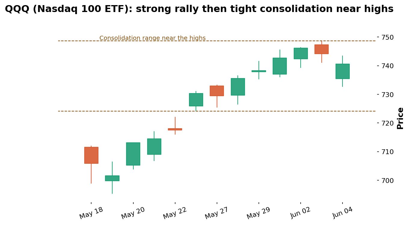
Data: stockanalysis.com (S&P Global), QQQ daily candles, May 18 – Jun 4, 2026.
The flagpole here is the sharp rally that carried QQQ from roughly $700 up through $740 over several sessions in late May, a genuinely powerful move. What follows, around the start of June, is the flag itself: a contained, sideways range near the highs roughly between $725 and $749, where neither buyers nor sellers could gain decisive control for a few sessions. This is the defining feature of a flag: a pause that occurs in the middle of a strong move rather than a reversal of it. The honest caveat the real data also provides is that QQQ's broader picture turned volatile immediately afterward, with the sharp June 5 plunge, which is a useful reminder that a flag indicates a probability of continuation, not a certainty, and must always be traded with the risk management framework from earlier in this series.
The triangle: converging support and resistance
A triangle, most commonly an ascending triangle in an uptrend, forms when price tests a flat resistance level multiple times while the pullback lows between each test get progressively higher, squeezing price into a narrowing range. The current QQQ dataset does not contain a clean, multi-week triangle, so the diagram below is a schematic illustration built specifically to show the shape clearly, not a real chart.
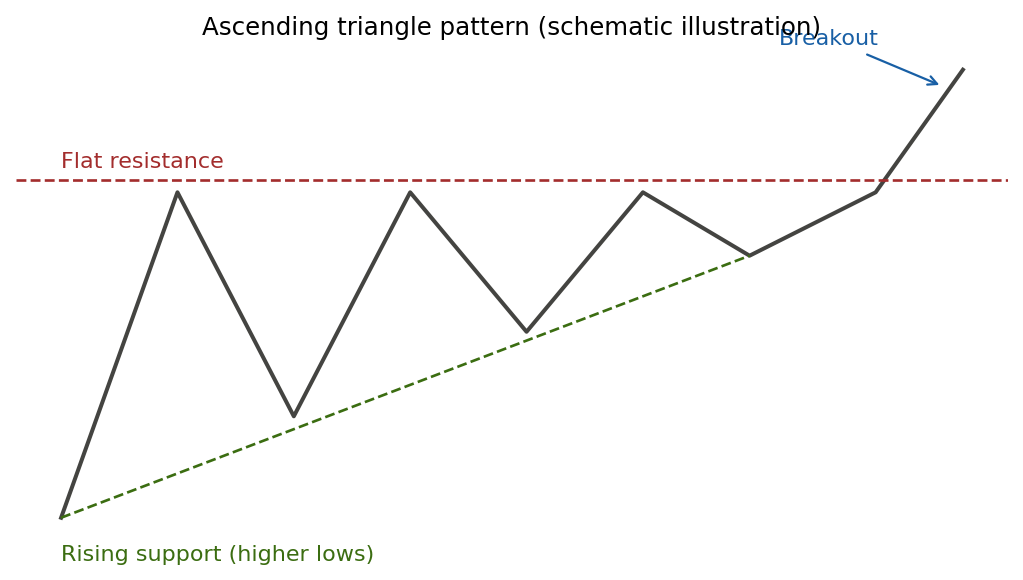
Schematic illustration, not real market data, created to show the general shape of an ascending triangle.
The flat top represents a resistance level that sellers defend repeatedly. The rising bottom represents buyers becoming more aggressive each time, refusing to let price fall back as far as the previous dip. As the range narrows, the contest typically resolves with a breakout in the direction of the rising line, here drawn as an upside break, because the buyers' increasing aggression is read as the more dominant force heading into the squeeze. A descending triangle is the mirror image, with a flat support level and progressively lower highs, typically resolving downward.
The head and shoulders: a classic reversal
The head and shoulders pattern forms after an extended uptrend and signals a potential transition to a downtrend. It consists of three peaks: a moderate peak (the left shoulder), a higher peak (the head), and a second moderate peak roughly similar in height to the first (the right shoulder), with a connecting line called the neckline drawn across the two pullback lows between the peaks. This exact shape does not appear in the current QQQ window, so the diagram below is again a clearly labeled schematic rather than real data.
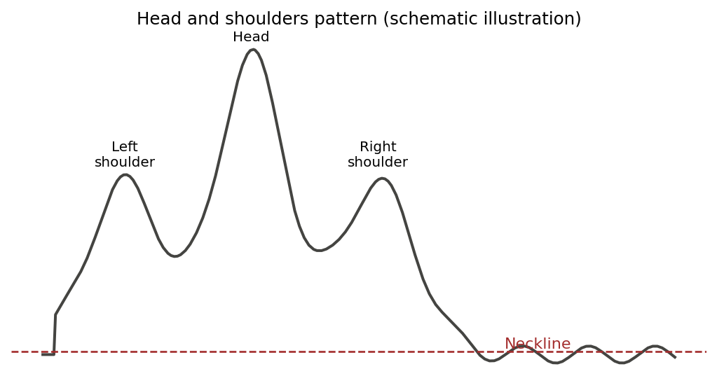
Schematic illustration, not real market data, created to show the general shape of a head and shoulders pattern.
The pattern is considered complete, and bearish, once price closes decisively below the neckline after forming the right shoulder. A common, rough way to estimate a downside target is to measure the vertical distance from the head down to the neckline, then project that same distance downward from the point where the neckline breaks. As with every pattern in this article, this measurement is a guideline based on historical tendency, not a guaranteed outcome, and the pattern fails on a meaningful percentage of real attempts, which is exactly why it should never be traded without the risk management framework covered earlier in this series.
Measuring price targets from a pattern
Each pattern comes with a rough, commonly used technique for estimating how far price might travel once it resolves. For a flag, the standard technique projects the height of the flagpole forward from the breakout point. Applied to the real QQQ flag above, the flagpole ran roughly from $700 to $740, about $40; projecting that from the consolidation breakout would suggest a target in the area of $780. The honest outcome in this real case is that the broader market turned volatile before any such clean target was reached, which is exactly why measured targets are treated as general areas to watch rather than precise predictions. For a triangle, the technique instead measures the height of the triangle at its widest point and projects that distance from the breakout.
These measuring techniques are deliberately rough, and experienced traders treat the resulting number as a general area to watch for potential resistance or profit-taking rather than a precise target. They are most useful in combination with support and resistance: a measured target that lands directly on a pre-existing level from prior price history carries considerably more weight than one in an area with no other supporting evidence.
Two more patterns worth recognizing
Beyond the three covered in depth, two additional shapes are common enough to mention. A double top forms when price rallies to a peak, pulls back, rallies again to a very similar peak, and then fails to make a new high, often signaling exhaustion similar to a head and shoulders but with a simpler two-peak structure. A double bottom is the mirror image, two similar troughs separated by a moderate rally, often marking the end of a downtrend. Both are read using the same core logic: a clearly defined level that price must break decisively before the pattern is confirmed, and a measured move technique for estimating a rough target.
The role of volume in confirming a pattern
Volume, the number of shares or contracts traded in a period, is one of the most useful confirming signals for any chart pattern, and ignoring it is a common beginner oversight. The general principle is that a genuine breakout from a pattern is usually accompanied by a noticeable increase in volume, reflecting real conviction behind the move, while a breakout on unusually light volume is more likely to be a false breakout that quickly reverses. During the consolidation phase of a flag, volume typically contracts, reflecting the pause in conviction as the market catches its breath, and then expands again as price breaks out and the trend resumes. The same logic applies to triangles, where the squeeze is usually accompanied by declining volume and the breakout by a surge, and to the head and shoulders, where many traders look for lighter volume on the right shoulder than the left as an early hint that buying conviction is fading. Volume is not infallible, and some genuine moves occur on unremarkable volume, but as a confirming input alongside the price pattern itself it meaningfully improves the odds of distinguishing a real breakout from a trap.
Patterns are context, not standalone signals
A theme worth emphasizing, because it ties this article back to everything before it, is that a chart pattern should never be read in isolation from the surrounding market structure. A bullish flag that forms right at a major resistance level identified through the support and resistance techniques earlier in this series is a far less appealing setup than the same flag forming with clear room to run before the next overhead level. A head and shoulders that completes right at a level where a longer-timeframe trend was already showing signs of exhaustion carries more weight than one appearing in the middle of a powerful, healthy uptrend. The pattern is one input; the trend it sits within, the levels above and below it, the momentum readings from the RSI, and the volume behavior around it are all additional inputs, and the highest-probability trades tend to be the ones where several of these independent factors point the same direction at once.
Why patterns fail, and how to handle it
Every chart pattern is a probability, not a certainty, and every one above fails a meaningful percentage of the time: flags sometimes break the wrong way, triangles sometimes squeeze and fail to follow through, and head and shoulders patterns sometimes form what looks like a complete right shoulder and then simply continue higher. This is precisely why a pattern should never be the entire basis for a trade. The pattern identifies a setup worth attention; a predetermined stop-loss, placed at the price that would prove the pattern wrong, is what protects you when that setup does not work out, as the QQQ flag's abrupt transition into June volatility illustrates.
Timeframe matters for every pattern
Every pattern can form on virtually any timeframe, and as a general rule the same shape carries more weight the longer the timeframe it forms on. A flag visible on a weekly chart, built from many weeks of consolidation, generally represents a more significant pause than a similar-looking flag formed over a few hours on an intraday chart, simply because far more total trading activity went into building the longer-timeframe version. This is part of why the multi-timeframe analysis covered later in this series matters even when applied specifically to pattern recognition: a pattern that appears on both a daily and a weekly chart is more trustworthy than the same shape that only shows up on a single short timeframe.
Patterns are easier to spot in hindsight than in real time
One honest caveat deserves emphasis. Every chart pattern looks far cleaner in a finished, historical chart than it does while actually forming, when you do not yet know whether the right shoulder will complete at a similar height to the left, or whether a sideways consolidation will resolve as a flag or break down into something else. This is not a flaw specific to beginners; it is inherent to pattern-based trading. The practical implication is to wait for a pattern to genuinely complete, meaning the relevant boundary has actually been broken with a real, closed candle rather than a brief intraday poke, before treating it as a confirmed signal rather than a tentative possibility still forming.
Key takeaways
Continuation patterns like flags and triangles form during a pause in a trend and typically resolve in the trend's direction; reversal patterns like the head and shoulders signal a potential change in direction.
The real QQQ data shows a flag-like consolidation near the highs in late May and early June 2026: a sharp flagpole rally followed by a contained range.
Triangles squeeze price between a flat boundary and a converging trendline, typically breaking in the direction the converging line is sloping.
A head and shoulders completes once price closes decisively below the neckline after the right shoulder, with a rough downside target found by projecting the head-to-neckline distance below the break.
Every pattern fails a meaningful percentage of the time, which is why a predetermined stop-loss based on what would invalidate the pattern is essential, never optional, as the QQQ flag's sudden transition into June volatility shows.
Disclaimer
This article is for educational purposes only and does not constitute financial or investment advice. Chart patterns reflect historical price behavior and do not guarantee future outcomes. The consolidation example shown here uses real historical QQQ data; the triangle and head and shoulders diagrams are schematic illustrations created to show the general shape of those patterns, not real market data. Always do your own research and consider consulting a licensed financial advisor before trading or investing.